I am currently in a tiny town in Tennessee called Chattanooga. It’s known for a few things – historically, Rock City, Ruby Falls, and Moon Pies. And bridges.
But over the last few years, Chattanooga’s grown into a hub for innovative ideas and technology. Some people used to call it the “Scenic City,” thanks to its location along the Tennessee River and the surrounding mountains. More recently it’s gained the name “Gig City”. Here’s why:
Chattanooga is the first city in the Western Hemisphere to offer one-gigabit-per-second fiber internet service to all residents and businesses. At 200 times the speed of the national average, the Gig opens the door to unimagined ways of learning, playing and conducting business.
Since then, the city has been host to new operations from Amazon, Volkswagen, and a few other interesting data analysis companies. It’s a place with lots of small tech events happening every month, and this month, I stopped by a little “guerrilla” conference called TopCon, for graphic designers. I didn’t have high expectations because it was inside of a former mechanic’s shop, it was only $25, and I’m not a graphic designer, but it turned out to be one of the best $25 I’ve spent (and not just because it came with two drink tickets for cocktails from the Chattanooga Whiskey company).
The biggest reason it was so inspiring was a single phrase from the first presenter, Aaron Robbs. Aaron began his career in Chattanooga, eventually moving to Atlanta around 2010, where he spent an uncomfortable amount of time unemployed — until he got a call from a little company called Mailchimp.
As an internet marketing company, Seth Turin Media has tested out several email marketing clients. Many recommend AWeber. A lot of businesses use Constant Contact or GetResponse. But Mailchimp, in my experience, has them all beat on one factor: Fun.
Mailchimp is fun to use. Go to the site and see for yourself if you haven’t before. Sign up for an account–it’s also free for the first 2,000 email addresses you want to email. (If you’re a serious internet marketer, you ought to be able to make a decent monthly income from targeted emails to 2,000 people who trust and respect your opinion.) I’ve recommended Mailchimp before, but after seeing this presentation, which put into perspective both how far they’ve come and how they put their company attitude into action to produce profitable results, I want to say it again. I love Mailchimp.
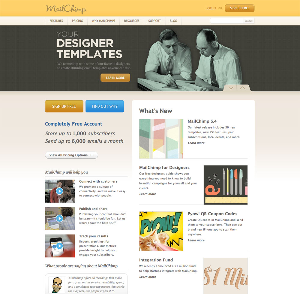
Aaron started at Mailchimp when their website looked like this:
As a brand, he explained that Mailchimp had always been “fun.” Their goal was to make a new website that kept that fun while offering a professional, organized appearance. At the time, “There wasn’t an existing grid, spacing, type style…nothing. Meta, Helvetica, Gotham, Lucida Grande, Georgia, and a handful of other typefaces were used freely everywhere.” He began to work on establishing conventions, creating a style guide that would restrict the lack of focus to something more singular, but still keep that sense of playfulness by using things like large fonts, illustrations, and color.
The reason for the company’s intense focus on user experience, he explained, was this motto:
“Delight Your Users.”
And as Aaron repeated that a few times throughout the presentation, it started to sink in. Delight your users.
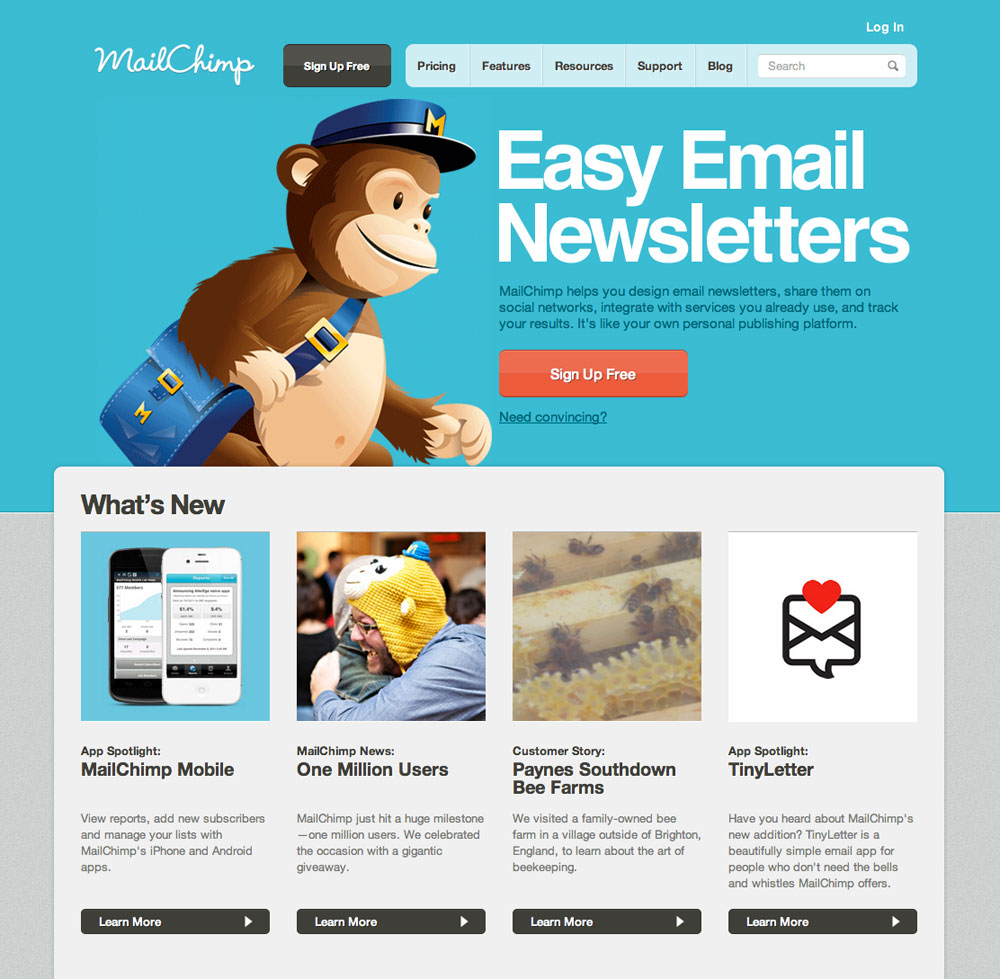
In 2013 we worked hard on a redesign of UBot Studio, both the software and the website, in an attempt to make them not only more professional, but also, more exciting and fun. We developed a style guide just like Aaron did at Mailchimp, and our artist and designers helped narrow down our visual style with specific colors, lines, and typefaces. I don’t know that we reached quite the drastic shift in our appearance that Mailchimp did after their redesign:
MailChimp after January 2011 Redesign
But I’m confident we moved in the right direction. Even Mailchimp’s site has gone through some changes since then, so it’s clear that constant improvement and working to find the best balance for both delightfulness and clarity is an ongoing process.
One of our main goals in making automation technology available for everyone is to make it not just easy to use, but fun. Learning how to program isn’t necessarily a “delightful” experience, but through features like recording, the drag-and-drop user interface, the new UI Editor, and the colorful and futuristic new UBot Studio software design, we want to make building apps an enjoyable experience. While a lot of our competitors don’t worry too much about this, we take a page from Mailchimp — who grew from 200,000 users to 4 million since that big site redesign — and try to make the experience of using our software not just easy, but delightful, whenever we can.
When people are delighted to use what you build, they will be drawn back again and again. The internet can often seem like a sterile place, filled with websites and products that don’t focus much on experience or personality. But, often times this is what our customers and clients remember most about us.
Remember to delight your users whenever you can, with features, bonuses, and little tricks and tips that make what they do better every day. No matter what you’re building, if you can make the experience dazzling for the user, then they’ll be happy to give you a shot. That conference I went to, in an emptied out windshield repair shop, with a bit of plywood in the corner, a deerhead on the wall, and a “TopCon” sign that broke free from its hanger during the middle of a presentation, was worth well over the $25 it cost to get in. What could have felt unsophisticated and makeshift instead felt candid and forthright, because the content was good, the attitude was relaxed, and the energy was positive. It was delightful.
And don’t worry if it takes some time to get it right. After all, it took Mailchimp’s team ten years to get where they are today. And when they started, their site looked like this:

Mailchimp Site circa 2001
– Jason
PS – I’m still a little bummed that the conference ran out of Mailchimp swag before I could get some. I really wanted one of those stickers. If anybody wants to trade for a couple TopCon pint glasses, email me.


I would have come to meet you Jason, I was just a stone’s throw away. Maybe we’ll catch up next time!
Great idea!